
A direct test of the flat earth model: flight times
More data supporting a spherical earth

After receiving such a surprising number of negative comments on our flat-earth rebuttal, I decided to perform a numerical analysis of the flat-earth model compared to the traditional spherical-earth model.
Science is about testing hypotheses, so let us set up an experiment to test these alternative views. For this, I enlisted the help of two of my children, ages 13 and 11. It made for a fun homeschool project.
The basic problem is the distance between longitude lines in the flat-earth model. In a spherical earth, the longitude lines start from one pole and converge on the other pole, and the distances get wider the closer they are to the equator. But in the northern-hemisphere–biased flat-earth model, the longitude lines start from the north pole and radiate outwards to the supposed ‘encircling southern polar ring’ like spokes on a wheel.
This means that the distances become greater the further south they go. This suggests an easy test of the two models: compare distances to travel times for distant places in the southern hemisphere.
The goal of this simple study was to compare reported airline flight time data with two distance measures, the ‘great circle’ distance of spherical-earth theory and the ‘straight-line’ distance of flat-earth theory.
The driving hypothesis is that the flat-earth map is distorted and so the flight times will not match the calculated distances. This, of course, assumes there is no great conspiracy among the millions of people working for the airline industry or the tens of millions of people who fly on their airplanes annually, which seems reasonable. I am also assuming airplanes on a flat earth would use the rule we all learned in geometry that ‘the shortest distance between any two points on a [standard, Euclidean] plane is a straight line’.
This assumption was in favor of the flat earth model for, as we will see, any curved line would only exacerbate the noticeable distortion with increasing flight time and distance from the source.

First, I obtained a map from the Flat Earth Society website (figure 1). With the help of one of my daughters, we located a suitable city that had many non-stop flights to different cities on other continents. In this case, we chose Johannesburg, South Africa.
We then looked up flights from this city and chose representative destinations on every continent (table 1). After carefully marking the city locations on a printed copy of the map, we painstakingly measured the distances between the cities using a ruler, to the nearest millimeter.
Table 1: Flight data from Johannesburg. Flight times and (great circle) distances were obtained from various online databases and calculators. Physical distances were measured on a globe using a taut string (to the nearest half-cm) and on the flat-earth map using a ruler (to the nearest mm). The globe was approximately 42 cm in diameter. The map was printed to the extents of an 8 ½ x 11 in. sheet of paper. Negative latitudes are south of the equator. Negative longitudes are west of the Prime Meridian.
| City | Airport Code | Latitude | Longitude | Flight Time (hrs) | Distance (km) | Measured Distances | |
|---|---|---|---|---|---|---|---|
| String (cm) | Flat (cm) | ||||||
| Johannesburg | JNB | -26.134 | 28.242 | -- | -- | -- | -- |
| Antananarivo | TNR | -18.797 | 47.479 | 3.2 | 2,156 | 6.5 | 3.2 |
| Mahé | SEZ | -4.674 | 55.522 | 4.9 | 3,752 | 12.0 | 4.2 |
| Dubai | DXB | 25.253 | 55.364 | 8.1 | 6,389 | 20.5 | 4.9 |
| Dakar | DKR | 14.740 | -17.490 | 8.5 | 6,705 | 21.5 | 5.6 |
| Tel Aviv | TLV | 32.011 | 34.887 | 9.1 | 6,473 | 20.5 | 4.4 |
| Perth | PER | -31.940 | 115.967 | 9.2 | 8,326 | 26.0 | 12.4 |
| Istanbul | IST | 40.976 | 28.814 | 9.5 | 7,430 | 24.5 | 5.0 |
| São Paulo | GRU | -23.382 | -46.469 | 9.8 | 7,451 | 23.5 | 9.9 |
| Madrid | MAD | 40.494 | -3.567 | 10.3 | 8,077 | 26.0 | 5.7 |
| Singapore | SIN | 1.359 | 103.989 | 10.4 | 8,661 | 27.5 | 9.7 |
| Frankfurt | FRA | 50.033 | 8.571 | 10.8 | 8,658 | 27.5 | 5.9 |
| Zurich | ZRH | 47.465 | 8.549 | 10.8 | 8,387 | 27.5 | 5.6 |
| Amsterdam | AMS | 52.309 | 4.764 | 11.1 | 8,986 | 29.0 | 6.1 |
| London | LGW | 51.148 | -0.190 | 11.3 | 9,004 | 29.0 | 6.2 |
| Sydney | SYD | -33.946 | 151.177 | 11.8 | 11,044 | 35.0 | 15.8 |
| Hong Kong | HKG | 22.309 | 113.915 | 12.8 | 10,672 | 34.5 | 9.8 |
| Beijing | PEK | 40.067 | 116.600 | 14.1 | 11,699 | 37.5 | 9.5 |
| New York | JFK | 40.640 | -73.779 | 15.8 | 12,824 | 41.0 | 9.9 |
| Atlanta | ATL | 33.637 | -84.428 | 16.4 | 13,581 | 44.0 | 10.6 |
Next, with the help of my son, we went to the local library because we knew they had a medium-sized globe (approximately 42 cm diameter). We could have simply used the great-circle calculations from table 1, but I felt it was more fair to use my own measurements since I was manually measuring the flat-earth distances. Plus the more error we added, the more difficult it would be to conclude one method was less accurate than the other. It was highly likely that my rudimentary string-on-a-globe method would be wildly inaccurate.
Taking a string, he held the end on Johannesburg while I attempted to make a great-circle to each city. Together, we measured the length of the string from the end to the point where I had pinched it, to the nearest half-cm. This level of precision was chosen so that it did not exceed that of the flat-earth measurements. I wanted to make sure there was a higher level of precision in the theory I do not support. I did not expect much success, and was surprised after I plotted the distances obtained from my string method vs. the great circle distances in table 1 and obtained a line of best fit with an R2 (correlation coefficient) greater than 0.99 (figure 2). According to the string lengths, the scale of the globe was about 313 km/cm.

The final step was to compare the spherical-earth and flat-earth distances with flight times. First, I graphed the great circle flight distances vs. the flight times I obtained from the internet. Given that we are dealing with different airlines, airplane models, airport approaches, and taxiing times, I expected to see more variability in the data. However, a straight-line approximation was obtained, with an R2 greater than 0.97 (figure 3).
This set a high standard for the flat-earth model to meet. The average speed (the slope of the line of best fit) was 871 km/hr, which is a good approximation of the average speed of a modern airliner. The modern long-distance commercial airplane is designed to cruise efficiently at around mach 0.8, with speeds depending on altitude, airplane type, and the speed of local air traffic. Thus, the reported great circle distances are an excellent estimation of the expected flight time. This is another high bar for the flat-earth theory to hurdle.
The next step was to add a comparison of flight speed vs. distance in the flat-earth model, but the data are not in the same units. In fact I had three different units with which to contend: km/hr, cm/hr on the globe, and cm/hr on the flat map. Yet, the solution to this dilemma is simple. The measured distances had to be normalized by dividing by the shortest distance in each dataset.

The normalized data revealed a tight correlation between the spherical earth model and flight time, but no apparent correlation was seen between the flat-earth model and flight time (figure 4). The flat-earth data are so bad that no additional statistical measures were warranted. There is simply no correlation, and the data points that are closest to being true are also the ones closest to the same longitude (i.e. the distances are not distorted by the flattening of the truly spherical earth onto the flat projection).
One might think that, since the normalized flat-earth data are generally below the others in figure 4, that the distances between these cities are shorter in the flat-earth model. However, the normalization process is entirely dependent on the shortest measured distance (in this case, Johannesburg to Antananarivo) and any distortion within the map projection will affect all data points. Since Madagascar is due east of southern Africa, and since both are at a relatively high latitude, the flat-earth projection artificially inflates the true distance.
Comparing the normalized flat-earth distance data to the city list in table 1 demonstrates that the cites with the greatest deviation from expected are the ones that are the farthest east and west of Johannesburg, namely Sydney, Perth, São Paulo, Singapore, and Hong Kong, in decreasing order.
Also, for any group of cities that are more or less along the same straight line from Johannesburg, the closer cities display less error than the farther ones. This is yet another example of the unreality of the flat-earth projection.
One additional measure is the string-length/flat-earth distance ratio. This will tell you proportionally how far apart the two distance measures are and it varies from 2.03 (Antananarivo) to 4.91 (Zurich). In this case, the ratio is highest for the cities in Europe and other places directly above southern Africa on the map, and lowest for cities farthest to the left and right. In fact, the angles of the lines in figure 1 are a direct estimate of this ratio. In other words, the flat map is distorting the true distances in a predictable manner.
Looking out the window
Unless we think all the flight times are wrong and the thousands of passengers are also lying about them, planes would have to be supersonic and have much greater fuel capacity than they do to make many of these routes. Also, the geography of the great circle routes on a global earth is very different from that of the straight-line routes on a flat disk. Passengers on multiple different flights would report seeing very different things out the window if the earth was flat.
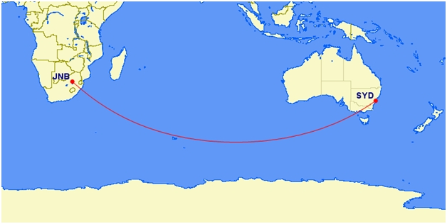
For example, passengers on the Johannesburg to Sydney flight have fairly monotonous scenery for nearly the entire trip: the southern Indian Ocean. On a flat earth, the flight would go over the Himalayas (which would be hard to miss!) and other land.
Conclusions
I have set up a simple experiment to test two alternative models of reality. The spherical-earth model came through unscathed. The flat-earth model simply fails to reflect reality. I even made simplifying assumptions in favor of the flat-earth.
Anyone reading this has but two choices: either accept this experimental evidence or reject the reported flight times. However, if you are toying with the latter, please consider that these are backed up by the personal experiences of millions of people and the economic needs of billion-dollar companies in a cut-throat industry where the smallest profit margin might make or break a company.
If you conclude that the flight time data are inaccurate (and they have to be very much so), you are rejecting the type of data upon which your entire society is based. You could not use a computer, drive a car, or read this internet article if this logic upon which this study is based is not real.
If you still want to retreat into the flat-earth position, you are neither siding with the near-unanimous conclusions of 2,000 years of Christian scholarship, the biblical text when properly placed in its grammatical and historical perspective, abundant and simple experimental science, or logic.
Thus, you have not a leg to stand on. Please consider your answer carefully! Also consider that I have not just thrown up a list of facts that supposedly support my own pet theory. I took a lot of time to actually analyze real data. Have you ever seen a flat-earth document that even attempted this level of analysis? No, I didn’t think so.


Readers’ comments
Comments are automatically closed 14 days after publication.